Note
Go to the end to download the full example code or to run this example in your browser via Binder
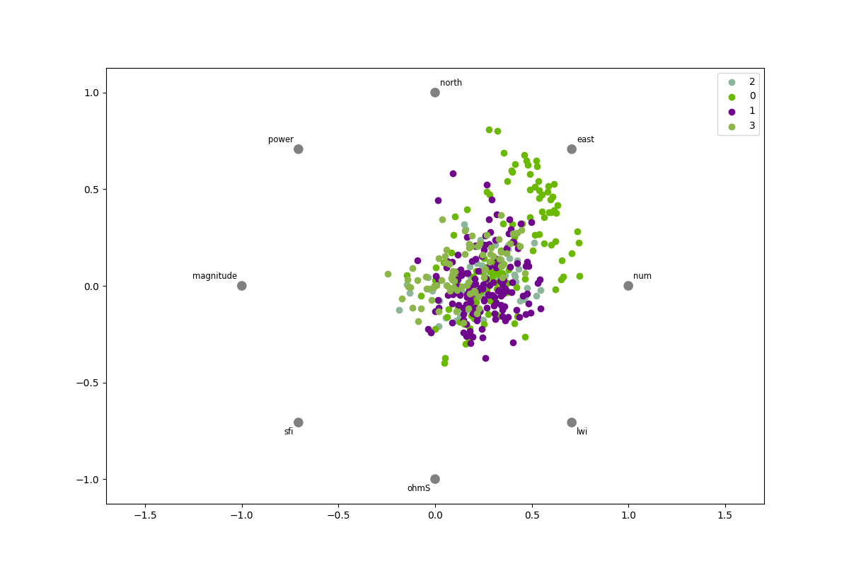
Plot radial (RadViz)#
shows each sample on circle or square, with features on the circonference to vizualize separately between target.
# Author: L.Kouadio
# Licence: BSD-3-clause
Note that the plot expects the values to be normalized. Thus, each figure has a spring that pulls samples to it based on the value.
from watex.datasets import fetch_data
from watex.view import ExPlot
# visualization using the yellowbrick package
data0 = fetch_data('bagoue original').get('data=dfy1')
p = ExPlot(tname ='flow').fit(data0)
# use the basic plots
# visualization using the pandas
# FR means f,low rate
classes = [
    "FR0 $(0m^3/hr)$",
    "FR1$(0<FR\leq 1m^3/hr)$",
    "FR2$(1< FR \leq 1m^3/hr)$",
    "FR3$(>3m^3/hr)$"
    ]
p.plotradviz(classes= classes )
<'ExPlot':xname=None, yname=None , tname='flow'>
Total running time of the script: (0 minutes 0.318 seconds)