Note
Go to the end to download the full example code or to run this example in your browser via Binder
Data exploratory: Quick view#
Real-world examples for data exploratory, visualization, …
# Author: L.Kouadio
# Licence: BSD-3-clause
Import required modules
import matplotlib.pyplot as plt
from watex.view import ExPlot, QuickPlot, TPlot
from watex.datasets import fetch_data , load_bagoue , load_edis
from watex.transformers import StratifiedWithCategoryAdder
Data Exploratory with ExPlot#
Explore data for analysis purpose
ExPlot is a shadow class. Exploring data is needed to create a model since
it gives a feel for the data and is also at great excuse to meet and discuss
issues with business units that control the data. ExPlot methods i.e.
return an instanced object that inherits from Baseplots
ABC (Abstract Base Class) for visualization
It gives some data exploration tricks. Here are a few examples for analysis
and visualization
Use parallel coordinates in multivariates for clustering visualization
(Need yelowbrick to be installed if ‘pkg’ argument is set to ‘yb’)
data =fetch_data('original data').get('data=dfy1')
p = ExPlot (tname ='flow').fit(data)
p.plotparallelcoords(pkg='pd')
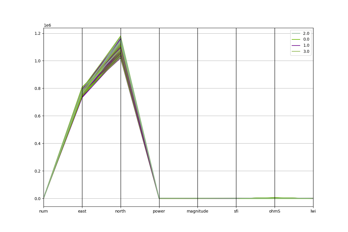
<'ExPlot':xname=None, yname=None , tname='flow'>
Plot each sample on a circle or square, with features on the circumference
to visualize separately between targets.
data2 = fetch_data('bagoue original').get('data=dfy2')
p = ExPlot(tname ='flow').fit(data2)
p.plotradviz(classes= None, pkg='pd' )
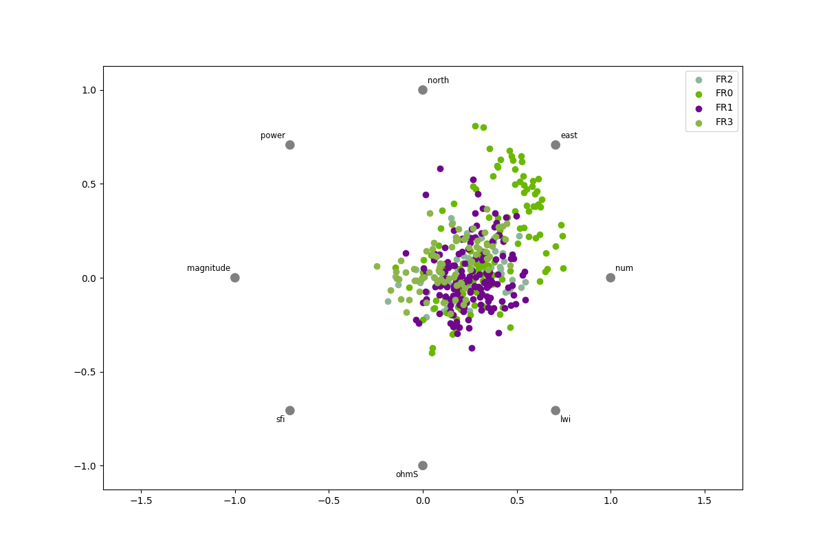
<'ExPlot':xname=None, yname=None , tname='flow'>
Create pairwise comparisons between features.
# Plots shows a ['pearson'|'spearman'|'covariance'] correlation.
data = fetch_data ('bagoue original').get('data=dfy1')
p= ExPlot(tname='flow').fit(data)
p.plotpairwisecomparison(fmt='.2f', corr='spearman',
                                     annot=True,
                                     cmap='RdBu_r',
                                     vmin=-1,
                                     vmax=1 )
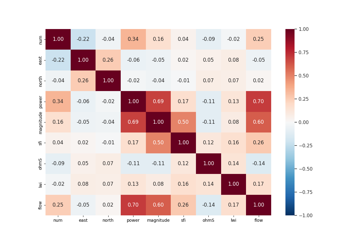
/home/docs/checkouts/readthedocs.org/user_builds/watex/checkouts/0.3.2/watex/view/plot.py:2662: FutureWarning:

The default value of numeric_only in DataFrame.corr is deprecated. In a future version, it will default to False. Select only valid columns or specify the value of numeric_only to silence this warning.


<'ExPlot':xname=None, yname=None , tname='flow'>
Create a pair grid.
# Is a matrix of columns and kernel density estimations.
# To colorize by columns from a data frame, use the 'hue' parameter.
data = fetch_data ('bagoue original').get('data=dfy1')
p= ExPlot(tname='flow').fit(data)
p.plotpairgrid (vars = ['magnitude', 'power', 'ohmS'] )
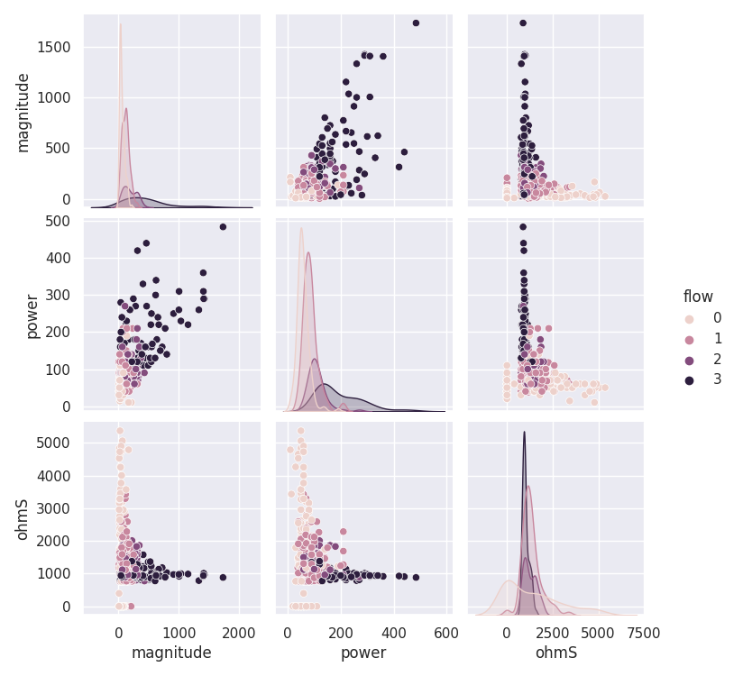
<'ExPlot':xname=None, yname=None , tname='flow'>
Features analysis with QuickPlot#
Special class dealing with analysis modules for quick diagrams, histograms, and bar visualization. Originally, it was designed for the flow rate prediction, however, it still works with any other dataset by following the details of the parameters. Here are some quick features analysis examples.
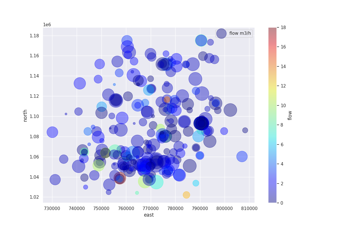
Create a plot of naive visualization
df = load_bagoue ().frame
stratifiedNumObj= StratifiedWithCategoryAdder('flow')
strat_train_set , *_= stratifiedNumObj.fit_transform(X=df)
pd_kws ={'alpha': 0.4,
         'label': 'flow m3/h',
         'c':'flow',
         'cmap':plt.get_cmap('jet'),
         'colorbar':True}
qkObj=QuickPlot(fs=25.)
qkObj.fit(strat_train_set)
qkObj.naiveviz( x= 'east', y='north', **pd_kws)
QuickPlot(savefig= None, fig_num= 1, fig_size= (12, 8), ... , classes= None, tname= None, mapflow= False)
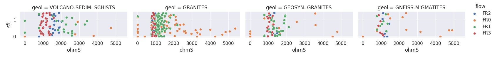
Provide the names of the features at least 04 and discuss their distribution.
This method maps a dataset onto multiple axes arrayed in a grid of rows and columns that correspond to levels of features in the dataset. The plots it produces are often called “lattice”, “trellis”, or ‘small multiple graphics.
data = load_bagoue ().frame
qkObj = QuickPlot(  leg_kws={'loc':'upper right'},
          fig_title = '`sfi` vs`ohmS|`geol`',
            )
qkObj.tname='flow' # target the DC-flow rate prediction dataset
qkObj.mapflow=True  # to hold category FR0, FR1 etc..
qkObj.fit(data)
sns_pkws={'aspect':2 ,
          "height": 2,
                  }
map_kws={'edgecolor':"w"}
qkObj.discussingfeatures(features =['ohmS', 'sfi','geol', 'flow'],
                           map_kws=map_kws,  **sns_pkws
                        )
QuickPlot(savefig= None, fig_num= 1, fig_size= (12, 8), ... , classes= None, tname= flow, mapflow= True)
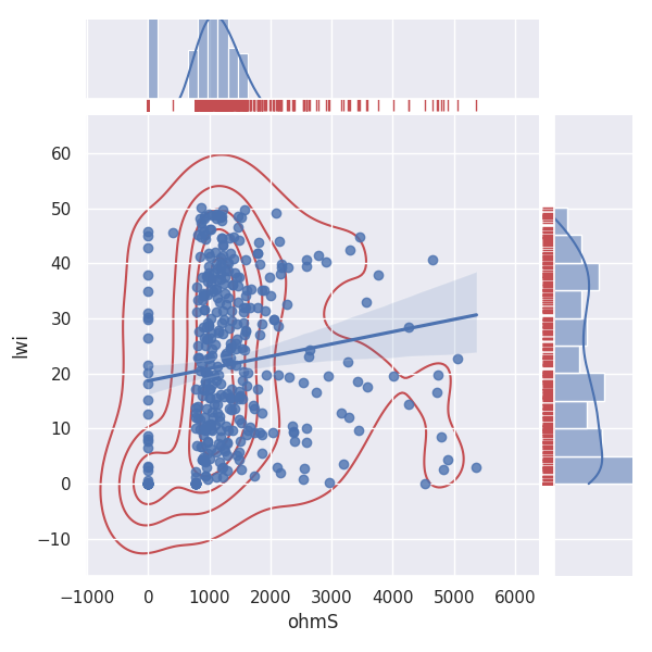
Joint method allows the visualization correlation of two features.
Draw a plot of two features with bivariate and univariate graphs.
data = load_bagoue ().frame
qkObj = QuickPlot( lc='b', sns_style ='darkgrid',
             fig_title='Quantitative features correlation'
             ).fit(data)
sns_pkws={
            'kind':'reg' , #'kde', 'hex'
            # "hue": 'flow',
               }
joinpl_kws={"color": "r",
                'zorder':0, 'levels':6}
plmarg_kws={'color':"r", 'height':-.15, 'clip_on':False}
qkObj.joint2features(features=['ohmS', 'lwi'],
            join_kws=joinpl_kws, marginals_kws=plmarg_kws,
                     **sns_pkws,
            )
QuickPlot(savefig= None, fig_num= 1, fig_size= (12, 8), ... , classes= None, tname= None, mapflow= False)
Tensors recovery with TPlot#
Tensor plot from EM processing data
TPlot is a Tensor (Impedances, resistivity, and phases ) plot class.
Explore SEG ( Society of Exploration Geophysicist ) class data. Plot recovery
tensors. TPlot method returns an instanced object that inherits
from watex.property.Baseplots ABC (Abstract Base Class) for
visualization. Here are a few demonstration examples.
Plot multiple sites/stations with signal recovery.
takes the 03 samples of EDIs
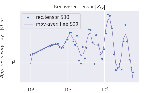
<AxesSubplot:title={'center':'Recovered tensor $|Z_{xy}|$'}, xlabel='$Frequency [H_z]$', ylabel='$ App.resistivity \\quad xy \\quad [ \\Omega.m]$'>
Plot two-dimensional recovery tensor
# get some 12 samples of EDI for the demo
edi_data = load_edis (return_data =True, samples =12 )
# customize the plot by adding plot_kws
plot_kws = dict( ylabel = '$Log_{10}Frequency [Hz]$',
                    xlabel = '$Distance(m)$',
                    cb_label = '$Log_{10}Rhoa[\Omega.m$]',
                    fig_size =(7, 4),
                    font_size =7.
                    )
t= TPlot(**plot_kws ).fit(edi_data)

# plot recovery2d using the log10 resistivity
t.plot_tensor2d (to_log10=True)
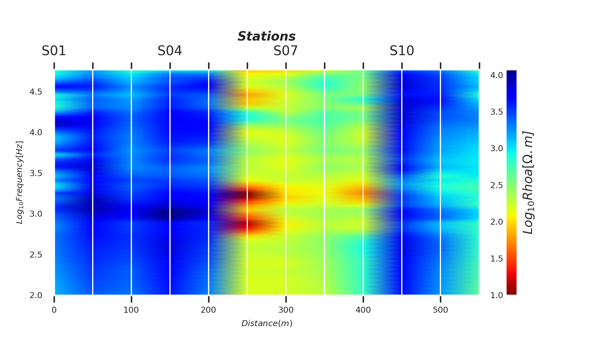
<AxesSubplot:xlabel='$Distance(m)$', ylabel='$Log_{10}Frequency [Hz]$'>
Plot two-dimensional filtered tensors using the default trimming moving-average (AMA) filter
# take the 12 samples of EDI and plot the corrected tensors
edi_data = load_edis (return_data =True, samples =12 )
# customize plot by adding plot_kws
plot_kws = dict( ylabel = '$Log_{10}Frequency [Hz]$',
                    xlabel = '$Distance(m)$',
                    cb_label = '$Log_{10}Rhoa[\Omega.m$]',
                    fig_size =(7, 4),
                    font_size =7.
                    )
t= TPlot(**plot_kws ).fit(edi_data)
# plot filtered tensor using the log10 resistivity
t.plot_ctensor2d (to_log10=True)
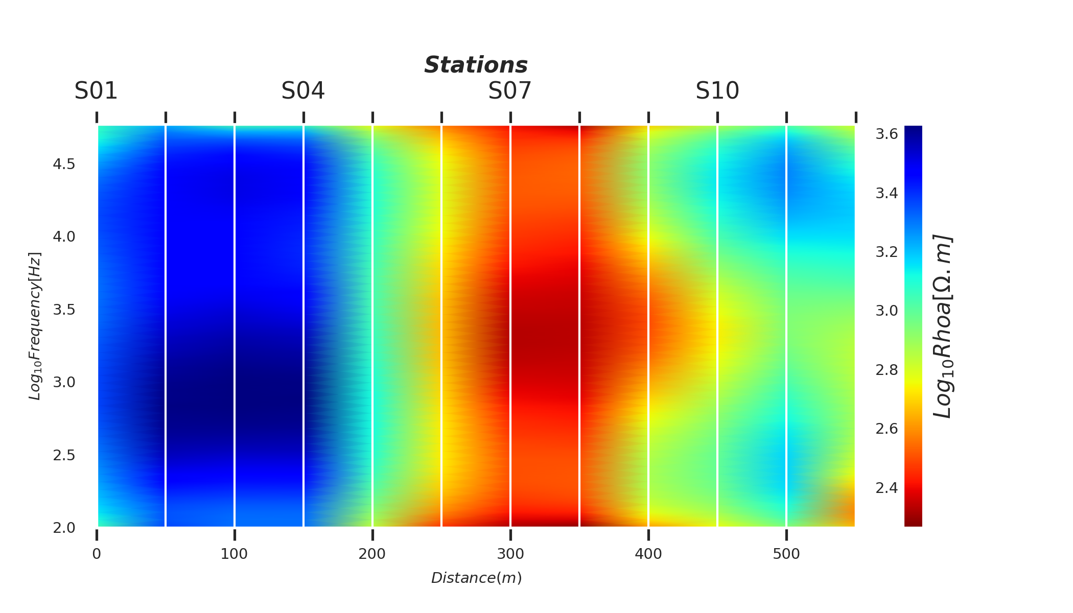
<AxesSubplot:xlabel='$Distance(m)$', ylabel='$Log_{10}Frequency [Hz]$'>
Model evaluation with EvalPlot#
Metric and dimensionality Evaluation Plots
EvalPlot Inherited from BasePlot. Dimensional reduction and metric
plots. The class works only with numerical features.
Plot ROC for RandomForest classifier
from watex.exlib.sklearn import RandomForestClassifier
from watex.datasets.dload import load_bagoue
from watex.utils import cattarget
from watex.view.mlplot import EvalPlot
X , y = load_bagoue(as_frame =True )
rdf_clf = RandomForestClassifier(random_state= 42) # our estimator
b= EvalPlot(scale = True , encode_labels=True)
b.fit_transform(X, y)
# binarize the label b.y
ybin = cattarget(b.y, labels= 2 ) # can also use labels =[0, 1]
b.y = ybin
b.font_size=7.
b.lc ='r'
b.lw =7.
b.sns_style='ticks'
b.plotROC(rdf_clf , label =1, method ="predict_proba") # class=1
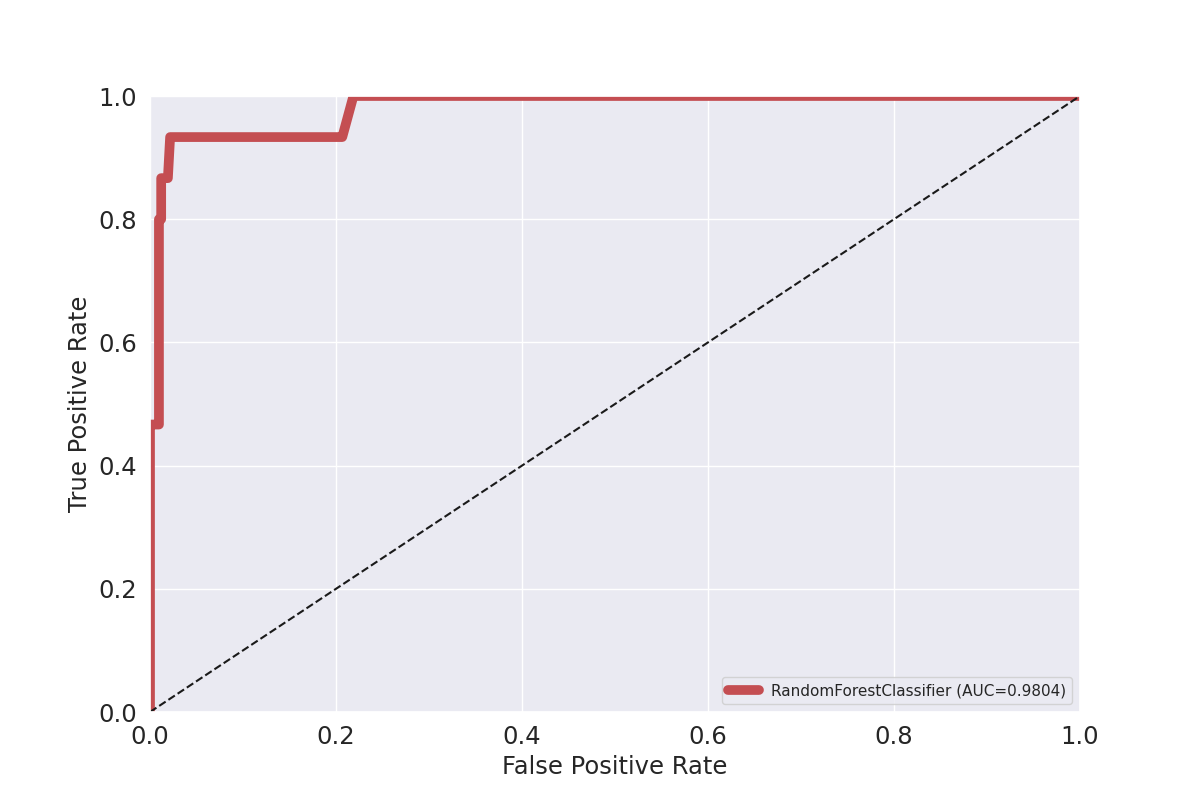
EvalPlot(tname= None, objective= None, scale= True, ... , sns_height= 4.0, sns_aspect= 0.7, verbose= 0)
Plot confusion matrix
customize plot
matshow_kwargs ={
        'aspect': 'auto', # 'auto'equal
        'interpolation': None,
       'cmap':'cool'}
plot_kws ={'lw':3,
       'lc':(.9, 0, .8),
       'font_size':15.,
        'cb_format':None,
        'xlabel': 'Predicted classes',
        'ylabel': 'Actual classes',
        'font_weight':None,
        'tp_labelbottom':False,
        'tp_labeltop':True,
        'tp_bottom': False
        }
# replace the integer identifier with a litteral string
b.litteral_classes = ['FR0', 'FR1']# 'FR2', 'FR3']
b.plotConfusionMatrix(clf=rdf_clf,  matshow_kws = matshow_kwargs,
                          **plot_kws)
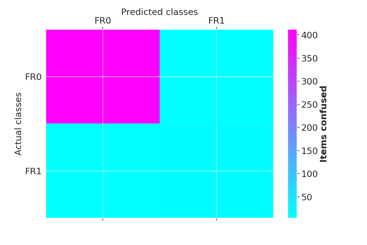
EvalPlot(tname= None, objective= None, scale= True, ... , sns_height= 4.0, sns_aspect= 0.7, verbose= 0)
Total running time of the script: (0 minutes 13.111 seconds)