Note
Go to the end to download the full example code or to run this example in your browser via Binder
Plot Skew 1D/2D#
Phase-sensitive skew visualization in one-dimensional and two dimensional.
# Author: L.Kouadio
# Licence: BSD-3-clause
‘Skew’ is also known as the conventional asymmetry parameter based on the Z magnitude.
Mosly, the EM signal is influenced by several factors such as the dimensionality of the propagation medium and the physical anomalies, which can distort the EM field both locally and regionally. The distortion of Z was determined from the quantification of its asymmetry and the deviation from the conditions that define its dimensionality. The parameters used for this purpose are all rotational invariant because the Z components involved in its definition are independent of the orientation system used. The conventional asymmetry parameter based on the Z magnitude is the skew defined by Swift (1967) [1] and Bahr (1991) [2].
swiftfor the removal of distorsion proposed by Swift in 1967. if the value close to 0., it assumes the 1D and 2D structures, and 3D otherwise.bahrfor the removal of distorsion proposed by Bahr in 1991. The threshold is set to 0.3 and above this value the structures are 3D. However, Values of \(\eta\) > 0.3 are considered to represent 3D data. Phase-sensitive skews less than 0.1 indicate 1D, 2D, or distorted 2D (3-D /2-D) cases. Values of \(mu\) between 0.1 and 0.3 indicate modified 3D/2D structures.
Here is an example of implementation using the watex.view.TPlot class
of module watex.view.
we start by importing watex as:
import numpy as np
import watex
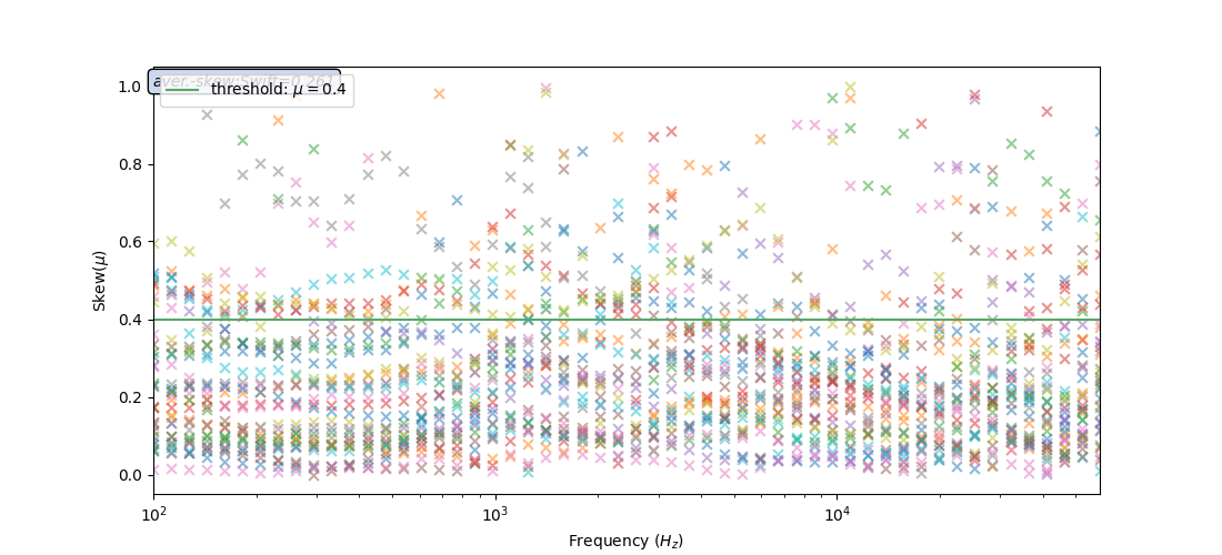
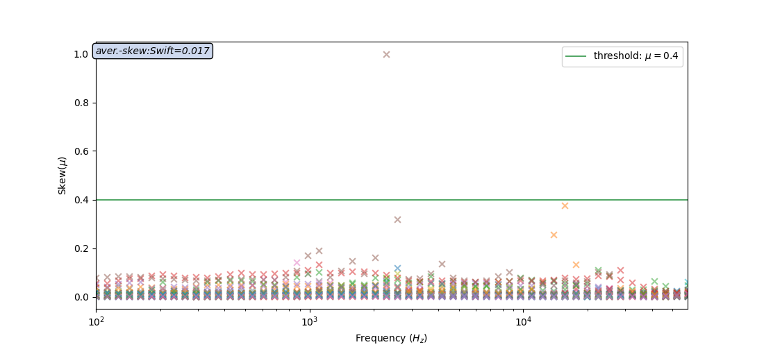
Swift method
test_data = watex.fetch_data ('edis', samples =37, return_data =True )
tplot = watex.TPlot(fig_size =(11,  5), marker ='x').fit(test_data)
tplot.plt_style='classic'
tplot.plotSkew(method ='swift', threshold_line=True)
<'TPlot':survey_area=None, distance=50.0, prefix='S', window_size=5, component='xy', mode='same', method='slinear', out='srho', how='py', c=2>
For any specific reasons, the user can check the influence of the existing
outliers in the data. This is possible by turning off the parameter
suppress_outliers to False like
tplot.plotSkew(method ='swift', threshold_line=True, suppress_outliers=False )
<'TPlot':survey_area=None, distance=50.0, prefix='S', window_size=5, component='xy', mode='same', method='slinear', out='srho', how='py', c=2>
Bahr method (default)
tplot.plotSkew(threshold_line=True, suppress_outliers=False )
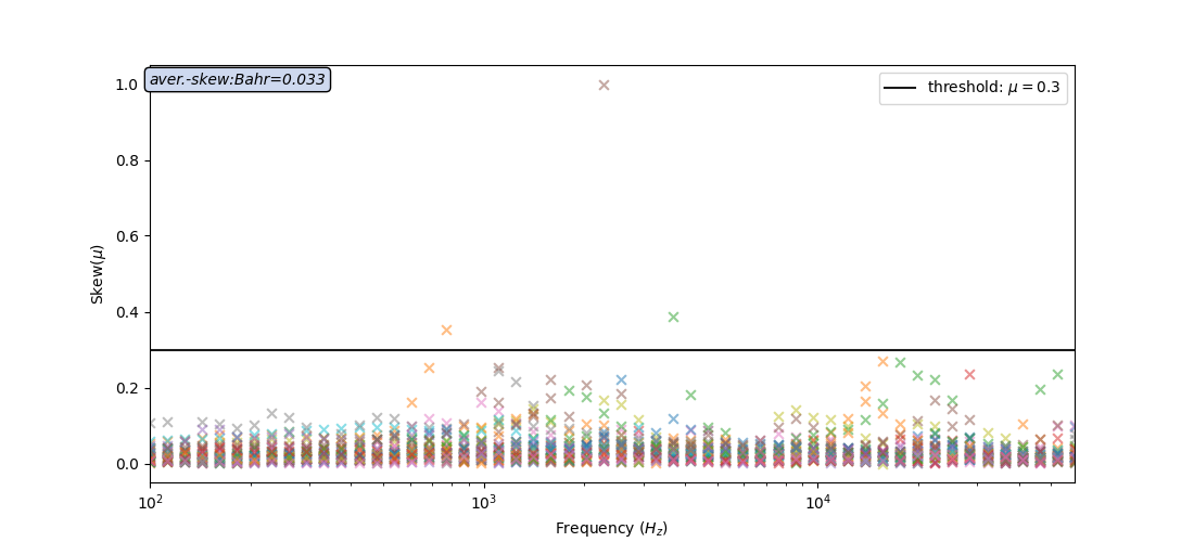
<'TPlot':survey_area=None, distance=50.0, prefix='S', window_size=5, component='xy', mode='same', method='slinear', out='srho', how='py', c=2>
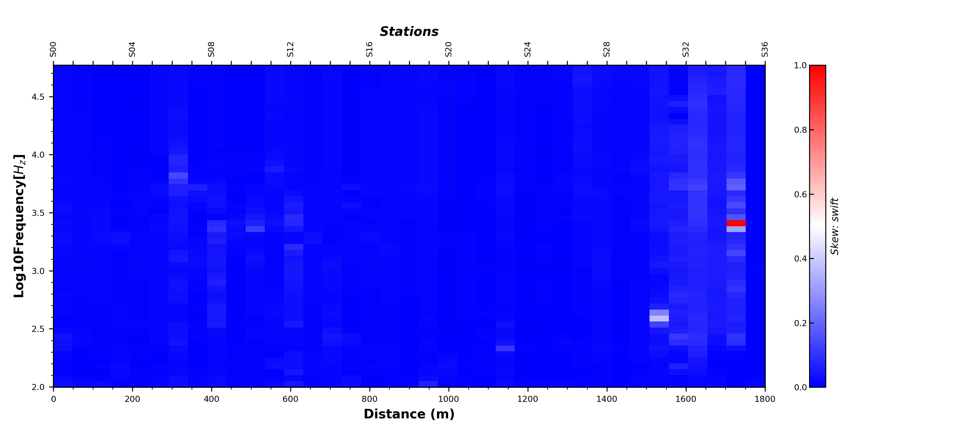
Plot skew in two-dimensional
It is possible to visualize the skew into two-dimensional by computing
the skew value from Processing class and call
the boilerplate plot2d function plot2d() for visualization.
In addition, setting the return_skewness parameter to skew
returns only the skew value. The default behavior returns both the skew and
the rotation all of invariant \(\eta\).
skv = watex.EMProcessing ().fit(test_data).skew(return_skewness='skew') # to return only skew value,
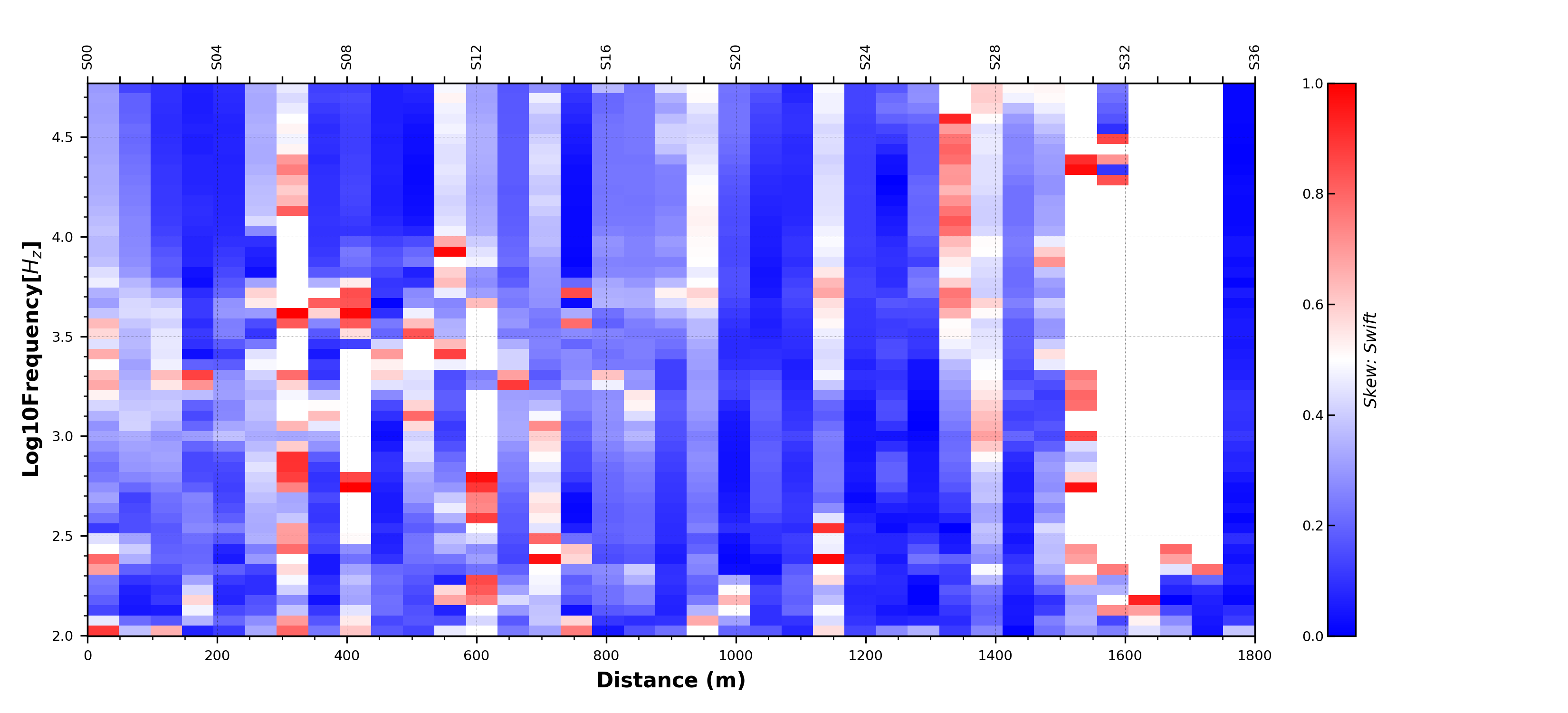
watex.view.plot2d (skv, y = np.log10 (tplot.p_.freqs_ ),
distance =50., # distance between stations
top_label='Stations',
show_grid =True,
fig_size = ( 11, 5 ),
cmap = 'bwr',
font_size =7,
ylabel ='Log10Frequency[$H_z$]',
xlabel='Distance (m)',
cb_label ='Skew: swift',
)
<AxesSubplot:xlabel='Distance (m)', ylabel='Log10Frequency[$H_z$]'>
As shown in Figure above, the value of skew is smaller than 0.4 at most sites, indicating a 2D structure. Only a few sites near the fault have a value of skew greater than 0.4, indicating an obvious 3D structure. Thus, the electricity model of the research area can be approximated to a 2D structure for inversion. In the next example, we will suppress the outliers in the data.
skv = watex.EMProcessing ().fit(test_data).skew(
    return_skewness='skew', suppress_outliers = True)
watex.view.plot2d (skv, y = np.log10 (tplot.p_.freqs_ ),
                   distance =50.,
                   show_grid =True,
                   fig_size = ( 11, 5 ),
                   cmap = 'bwr',
                   font_size =7,
                   ylabel ='Log10Frequency[$H_z$]',
                   xlabel='Distance (m)',
                   cb_label ='Skew: Swift',
                   )
<AxesSubplot:xlabel='Distance (m)', ylabel='Log10Frequency[$H_z$]'>
The figure above shows the 2D skewness when some outliers are suppressed. Here most of sites shown a skew less than 0.4 althrough the outliers are suppressed. Most of structures are 2D dimensional therefore the 2D inversion can be performed. The blank lines show the data points assumed to be outliers expressed by missing, noised data or weak signals.
Total running time of the script: ( 0 minutes 3.432 seconds)